Your Landing Page Is Why Your Ads Aren't Converting (Fix These 9 Things)
Most ROAS problems aren't ad problems — they're landing page problems. The ad was good enough to get the click. The page gave them every reason to leave. Here are the 9 fixes that move conversion rates, ranked by impact.
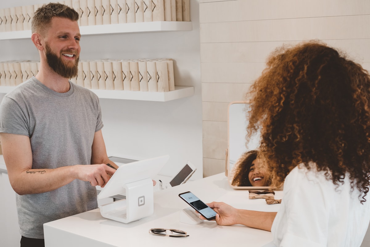
The ad worked. It got the click. Then the landing page took over — and most landing pages are losing the sale before the visitor even reads the headline.📷 Unsplash
Here's a conversation I have constantly with DTC founders who are frustrated with their ROAS:
Them: "The ads aren't working."
Me: "What's your CTR?"
Them: "Like 2.8%. Which is fine, right?"
Me: "Yeah, that's fine. What's your CVR?"
Them: "0.8%."
And right there — that's not an ad problem. Your ad worked. 2.8% CTR means something about your ad resonated enough for people to click. 0.8% CVR means the landing page took that motivated visitor and talked them out of buying.
I see this constantly. The ad gets all the attention, optimization, and testing budget. The landing page gets built once and forgotten. And that imbalance is where most e-commerce ROAS problems actually live.
1.96%
average e-commerce landing page conversion rate (Unbounce Benchmark, 2026)
11.45%
conversion rate of the top 10% of landing pages — 5.8× the average
53%
of mobile visitors who abandon if a page takes more than 3 seconds to load (Google)
72%
of paid social ad clicks that arrive on mobile — but most pages are designed on desktop
The math here is uncomfortable. If you're getting 1,000 clicks at $1 each and converting at 0.8%, that's 8 sales for $1,000. Fix the page to hit the 1.96% industry average and you get 19.6 sales from the same spend. Hit the top 10% at 11.45% and you get 114 sales.
That gap is not marketing strategy. That's plumbing.
Fix the message match first
Before anything else: does your landing page say the same thing your ad says?
Not kind of. Literally.
Your ad made a specific promise. "50% off your first order." "Clears acne in 30 days or your money back." "Free shipping, no minimum." The visitor clicked because that specific promise caught them. They arrive on your page and if they don't see that promise immediately, the mental contract breaks. They're gone.
Broken message match (kills conversions)
Ad: '50% off your first box — this week only'
Landing page: your homepage with 12 products and a navigation
No mention of 50% off until you scroll down
Page headline: 'Premium Supplements for Peak Performance'
Generic CTA: 'Shop Now'
Tight message match (what actually works)
Ad: '50% off your first box — this week only'
Landing page: dedicated offer page, single product or bundle
Hero headline: 'Get Your First Box 50% Off'
Countdown timer showing when the offer ends
Single CTA: 'Claim My 50% Off →'
The fix almost always means building dedicated landing pages per campaign rather than sending ad traffic to your main site. Yes, it's more work. The conversion lift is typically 30–80% because you're no longer making people hunt for the thing the ad promised them.
Page load speed is silently killing you
I'm going to say something that most ad marketers don't want to deal with because it feels like a "developer problem": your page load speed is probably losing you more conversions than bad creative.
53% of mobile visitors leave a page that takes more than 3 seconds to load. The average paid traffic landing page loads in 4.7 seconds on mobile. Do the math. That means more than half your ad clicks are bouncing before they've seen a single word of your offer.
And here's the brutal part: those clicks still cost you money. You're paying for visits that never happen.
“We spent $40k testing creatives and audiences over six months and couldn't crack 1.2% CVR. Removed 11 Shopify apps, compressed our images, moved our hero video to autoplay-off. Page went from 5.1 to 1.8 seconds. CVR hit 2.9% in two weeks. We had been optimizing the wrong thing the entire time.”
Run your landing page through Google PageSpeed Insights right now. Most people who do this for the first time are shocked by what they find.
The most common culprits:
Hero images over 300KB. Compress everything. Use Squoosh or Cloudinary. This alone fixes a huge chunk of most load time issues.
Shopify apps. Every app you install adds JavaScript that loads on every page. Most Shopify stores have 15–20+ apps running simultaneously. Each one is taxing your load time.
Autoplay video. Video is great for conversion — but autoplay video that loads immediately is terrible for page speed. Set it to autoplay only when visible (lazy load).
Third-party scripts loading in <head>. Your heatmap tool, chat widget, review app, and loyalty program are all fighting each other to load first.
A 1-second improvement in mobile load time increases e-commerce conversions by ~8%, per Google's own data. That's not a "nice to have." That's a significant lever most stores haven't pulled.
⚠️Your PageSpeed score and your actual experience are different things
PageSpeed Insights gives you a score, but the more useful number is Time to First Contentful Paint and Largest Contentful Paint — these tell you how long until a visitor sees something useful. Aim for LCP under 2.5 seconds. If you're above 4 seconds on mobile, that's your most urgent conversion problem.
Your headline is answering the wrong question
Most landing page headlines answer "who are we?" or "what do we sell?" Those are the wrong questions.
The question your headline needs to answer is: what does the visitor get?
Wrong: "Premium Skincare Made with Natural Ingredients"
Wrong: "The Original Vitamin C Serum Since 2019"
Right: "Look 10 Years Younger in 4 Weeks — or Your Money Back"
Right: "The Serum 47,000 Women Use Every Morning"
The first two are about you. The last two are about the outcome the customer gets. People don't buy products. They buy the result of using the product. Your headline needs to sell the result, not the product.
A formula that works across almost every category: [Specific outcome] in [timeframe] + [credibility signal]
Test 3–4 headline variations before concluding your page is optimized. The winning headline can move conversion rates by 20–40% on its own. That's a bigger swing than most ad creative tests.
Where you put social proof matters
You probably know that social proof matters. You have reviews on your product page. Maybe a "4.8 stars from 12,000 reviews" badge somewhere in the header.
The question isn't whether to include social proof. It's where.
The most valuable real estate on any landing page is immediately adjacent to your CTA button. That's where buying hesitation peaks — the visitor is at maximum consideration, one moment away from pulling out their card. That's exactly where you need to place your most credible proof.
What works next to the buy button:
A star rating with a specific review count ("⭐ 4.8/5 from 12,400 verified purchases")
One or two specific testimonials that describe a real outcome — not "love this product!" but "down 12 pounds, my knees stopped hurting, I'm sleeping better"
A real scarcity signal if you have one ("47 left at this price" — only if actually true)
Generic testimonials actively hurt conversion by using up trust-building space without providing trust. "Great product, highly recommend!" could have been written by anyone about anything. It provides zero buying confidence. Specific, outcome-driven testimonials from real people with real results are dramatically more persuasive.
Where you put social proof matters as much as whether you have it. Right next to the buy button is where buying hesitation is highest.📷 Unsplash
Mobile-first isn't a checkbox
72% of paid social clicks arrive on mobile. Which means the version of your landing page that most of your ad traffic sees is the mobile version.
Yet most people design their landing page on a desktop, then check it on mobile and call that "mobile optimization." That's not mobile-first. That's mobile as an afterthought.
Mobile-first means you design for a 390px screen width first, and expand to desktop second. In practice, this means:
Font size minimum 16px for body text. Anything smaller forces people to pinch-to-zoom, which kills the experience immediately.
Buttons at minimum 48px tall. Thumb-tappable without requiring precise targeting. If your button is 36px tall, people are missing it on mobile and bouncing without ever clicking.
No horizontal scroll. Everything needs to fit within the viewport width without side-scrolling.
Forms with maximum 3–4 fields. Every field you add costs you roughly 20% of mobile form completions. Only ask for what you absolutely need.
Open your landing page on your phone right now. Go through the full purchase flow. Most people who do this for the first time find 3–4 things that would have made them leave.
The stock photo problem
I know this one sounds aesthetic, not strategic. Bear with me.
Your competitor is using the same Shutterstock photo you are. Possibly literally the same one — licensing doesn't restrict exclusivity. Stock images signal inauthenticity, which increases buying friction, which reduces conversion.
Nielsen Norman Group's eye-tracking research shows that visitors ignore stock photos entirely — their eyes track right past them to the actual content. But they stop and engage with authentic, specific imagery: real customers using your product in real settings, before/after photos, team photos.
UGC (user-generated content) photos outperform professional product photography in most DTC conversion tests. A shaky iPhone photo of a real customer using your product is more persuasive than a studio shot — because it's believable.
The practical path: ask your first 50–100 customers to send you a photo of them using the product. Offer a discount code. Use those photos on your landing pages before you spend anything on professional photography.
The 5-second test (run it before you spend another dollar)
Here's a dead-simple test: show your landing page to someone who doesn't know your brand. Give them 5 seconds. Close the tab. Ask them:
What does the company sell?
What do you get specifically?
What are you supposed to do on this page?
If they can't answer all three, your page is failing the clarity test before a visitor even has a chance to get to the buy decision.
Quick check
A fashion brand has a 2.8% ad CTR (strong) but 0.6% CVR (weak). Their top hypothesis is that their price point is too high. What should they actually test first?
The 9-point audit
Go through this before spending another dollar on ads
✓Message match: does the landing page headline reflect the ad headline almost word-for-word?
✓Load speed: does the page load in under 3 seconds on mobile? (Run it through pagespeed.web.dev right now)
✓Single CTA: is there one primary CTA above the fold? Is the navigation removed or hidden?
✓Outcome headline: does the hero headline describe what the customer gets, not what you sell?
✓Social proof placement: is your strongest testimonial or rating within scrolling distance of the buy button?
✓Mobile layout: minimum 16px font, 48px buttons, no horizontal scroll?
✓Photography: real customers and products, not stock images?
✓5-second test: can a stranger articulate what you sell, what they get, and what to do next?
✓Trust signals: money-back guarantee, free returns, or security badge near the CTA?
The uncomfortable math one more time: if you're getting 1,000 ad clicks at $1 each and converting at 0.8%, fixing your landing page to the industry average of 1.96% almost triples your sales from the same spend.
Most advertisers are burning budget optimizing the click while the page leaks the conversion. The click is the easy part. The page is where it gets lost.
Go run the audit above on your top landing page. You'll find something fixable in under 20 minutes, and it'll move your ROAS more than any creative test you've run in the last month.
Your Landing Page Is Why Your Ads Aren't Converting (Fix These 9 Things) — Fly Adsly Blog | Fly Adsly